Munch’s The Scream (1895)
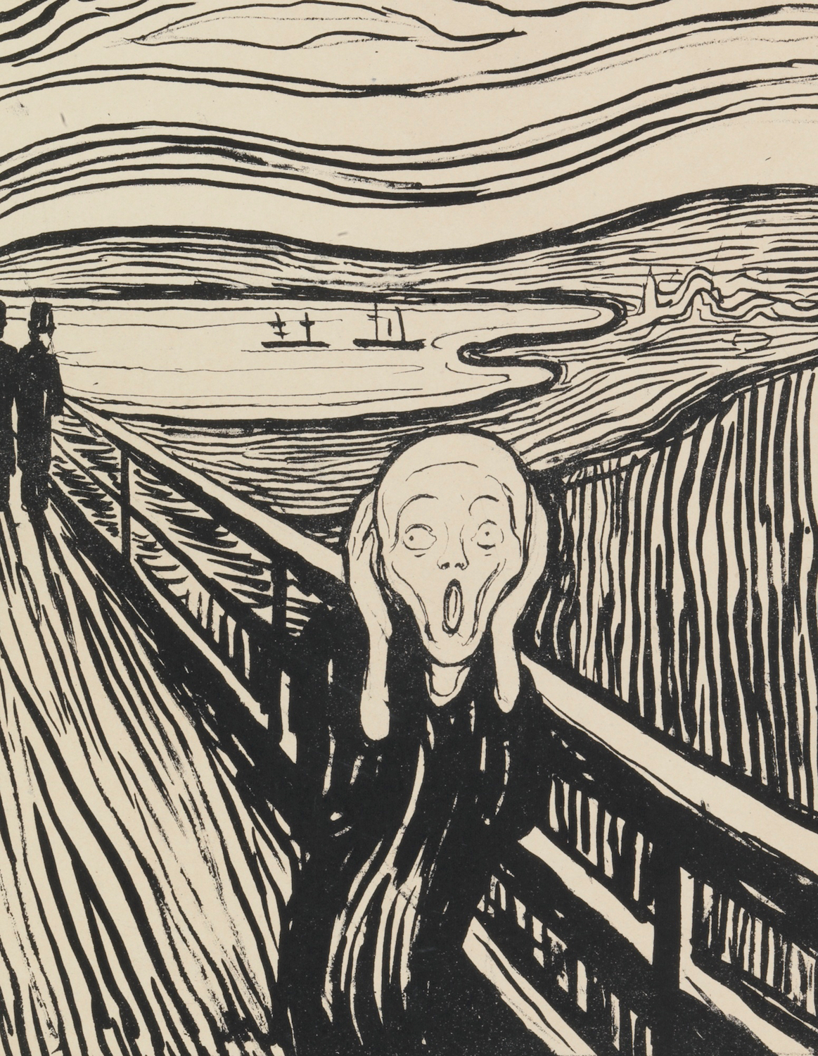
Edvard Munch, The Scream (1895) Lithograph on paper.
Click image to enlarge.
In 1893 Edvard Munch created four similar versions of his famous Scream in oil and pastel. A year or so later he made a print of it but altered, among other features, the two ships in the fjord. As a whisper in The Scream, this detail has been ignored. We shouldn't make the same mistake....and you don't have to.
Follow the themes on EPPH to get a sense of how they appear over and over again in different settings and centuries. For instance, if you have read examples under Letters in Art and Visual Metamorphosis and know from EPPH the importance of the artist's name, you could have seen this unseen feature of Munch's Scream for yourself.
Click next thumbnail to continue
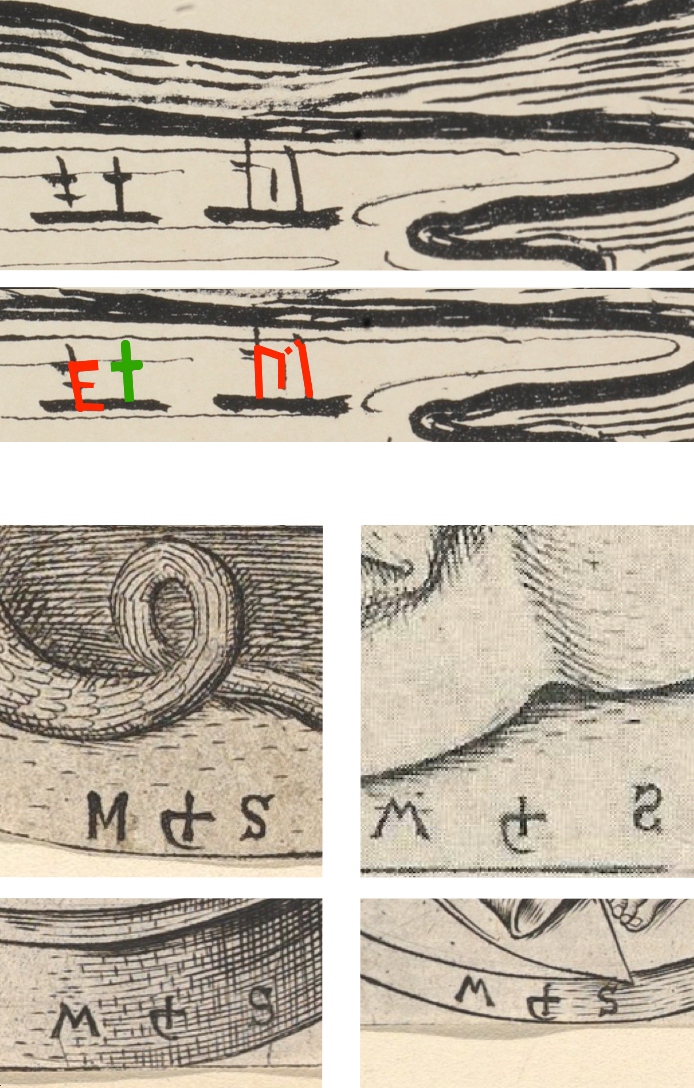
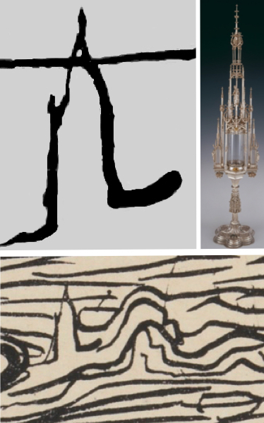
Top: Detail and diagram of Munch's The Scream
Bottom: Four examples of Martin Schongauer's monogram
Click image to enlarge.
The masts of the ships in the prior versions are largely indecipherable but here (top) he drew emphatic lines. The mizzenmast mast of one ship (left) holds two yards, its foremast one. The other is three-masted with, oddly, the mainmast shortest. That curiosity is a give-away. Notice how in doing so, Munch forms an E on one ship and an M on the other, his two initials joined by a Cross in between (diagram.) That form then refers to the 15th-century printmaker Martin Schongauer who was a major influence on Munch's style.
In his monogram Schongauer, like Munch here, joined his initials with a Cross. (See examples.) One of art's core principles is that we are all unified and divine; in Christian art that means God or Christ. Indeed Munch once said that people should understand the holiness of art and take off their hats to paintings "as if they were in church."1 Now note how one of Schongauer's monograms has an S inverted.
Click next thumbnail to continue
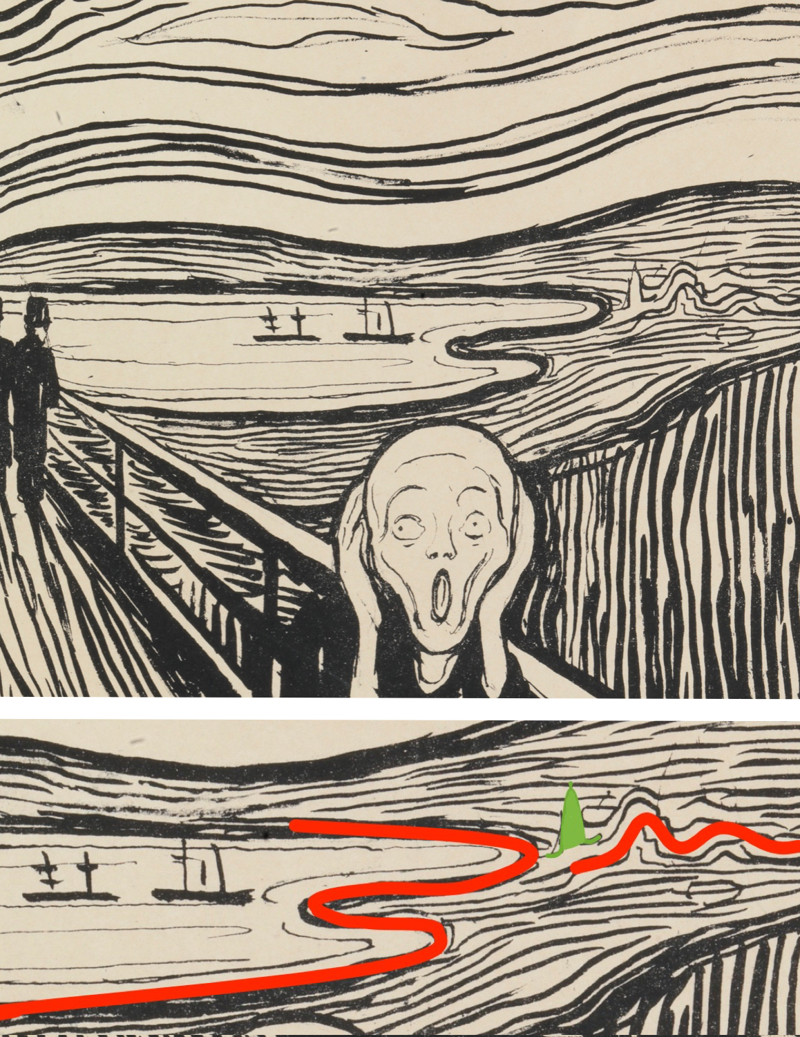
Detail and diagram of Munch's The Scream
Click image to enlarge.
Inversion is meaningful. The mind has long been likened to a mirror and is linked in our language to thought as a mental reflection. So Munch, depicting his mind as ever, inverted a second E in the shape of the fjord. His M is there too in two little hills with his initials again joined by a Christian symbol: a steepled church in place of the Cross. This second set seems to suggest that Munch is again depicting the creative process.2 His initials emerge out of the landscape like a vague mental image out of the sub-conscious. The letters then become more precise on the fjord just as a mental image becomes more precise in an artwork. Even the meandering outline of the church becomes the distinct form of the Cross. The church, though, is fascinating. Despite its apparent vagueness, we can identify it without major effort.
Click next thumbnail to continue
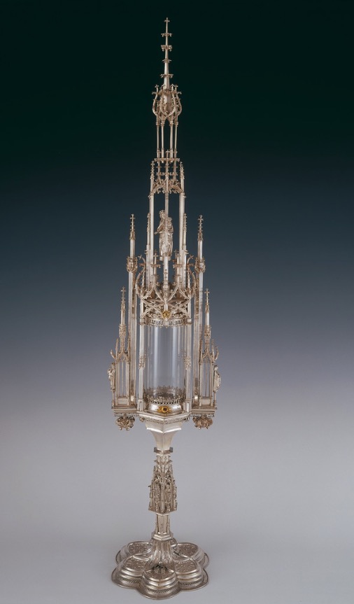
Jörg Schongauer, The Munch Monstrance (c.1490-93) Silver embossed, cast. The Treasury of Basle Munster.
Click image to enlarge.
On suspecting that Munch's monogram was based on Schongauer's, I googled their names together and what came up was a monstrance.3 A monstrance is a transparent receptacle for holding the Host at Mass. Around 1490 Martin Schongauer's goldsmith-son created one of the most beautiful Late Gothic examples using, for the most part, designs from his father's prints. But - here's the marvel - this monstrance by Schongauer is known as The Munch Monstrance because it bears the coat-of-arms of the Munch family. Whether they were Edvard's ancestors or not does not really matter and I don't know the answer.
Click next thumbnail to continue
Top L: Photoshopped detail of the church in The Scream
Top R: The Munch Monstrance
Bottom: Munch's The Scream, detail
Click image to enlarge.
Munch, I believe, turned the monstrance into a church to deepen his identification with Schongauer. Three details suggest this. [The church in top left image was enlarged and photoshopped to make the relevant lines clearer]. The walls of the tower blend so emphatically into the ground that they join to it like the monstrance to its base, both slightly concave. Out of its left side a line shoots upwards like Schongauer's Gothic spires. Lastly Munch drew a ground line right through the steeple as though it was transparent. A great artist would not make that 'mistake' unless he intended it. To me, his reason is apparent. The monstrance is transparent by its very nature. Thus, so is his church. As Munch's symbols for the purity of his own creative mind, the two objects are both see-through and clear.
Postscript (2018): An observant reader has just informed me that I missed the most obvious M of all. The screamer himself is shaped into the letter M. His wrists and hands (all white) are the uprights of his initial while the contour of his cheeks and chin form the V-shaped bridge between. For comparison, take a look at Raphael's Sistine Madonna (1512) or Dürer's Virgin and Child (1491).
More Works by Munch
Notes:
1. Cited in Poul Erik Tøjner, Munch In His Own Words (Munich: Prestel) 2003, p.60
2. See EPPH's explanation of Munch's Old Man Praying (1902)
Original Publication Date on EPPH: 02 May 2016. © Simon Abrahams. Articles on this site are the copyright of Simon Abrahams. To use copyrighted material in print or other media for purposes beyond 'fair use', you must obtain permission from the copyright owner. Websites may link to this page without permission (please do) but may not reproduce the material on their own site without crediting Simon Abrahams and EPPH.