Logos (no, not that one!) and Art

Lochness by Navy Blue Design
Foreign words can sometimes sound more intellectual than those we use in English. That's why when logos is mentioned in reference to art it generally refers to the beginning of St. John's Gospel and is set in italic…"In the beginning was the Word………" Here though, because I am more practiced at visual art than literature, "logos" refers to those symbols graphic designers create using the same little-known methods of the great masters that we teach and reveal here. Here are five selected at random from the website www.logofaves.com. The trick involved is worth looking for because when you see something similar in a work of art you will have primed the particular neuron associated with it to fire more strongly. Thus, as with music and listening, the more you practice looking, the more you'll see.
In Lochness (above) note how the thin white line through the first three letters suggests the surface of water while the bottom of the "L"'s reflection curls the wrong way for a reflection. It should curl to the left. Like the inaccurate reflections in many of art's most famous mirrors (Velazquez's Las Meninas, Manet's A Bar at the Folies-Bérgère, Picasso's Girl Before a Mirror, etc.) the bend to the right might be wrong as a reflection but correct in a more important sense, as both the proper direction for the letter 'L' and the monster's body.
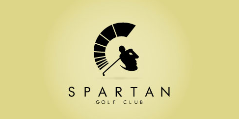
Spartan Golf Club by Harry Fonteneau
Spartan Golf Club turns the figure of a golfer into the profile of a Spartan with the dashes of his swing substituting for the crest of his helmet. Michelangelo did something similar with St. Peter's figure in The Last Judgement and so did Albrecht Dürer in his engraving of The Death of Orpheus.
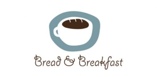
Bed and Breakfast by Strudel Design
Bed & Breakfast uses the oval of the cup's opening to suggest a loaf of bread with the addition of only 3 short lines just as Picasso turned an arch of trees into the Queen of Spain's hair-do.
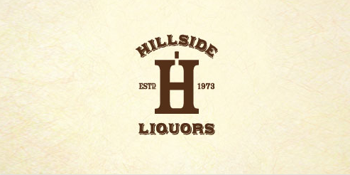
Hillside Liquors by Colin Tierney
Few people see the bottle in Hillside Liquor's logo at first go but, after they do, it will be that much easier to recognize how Tilman Remenschneider turned the foot of a saint in the early sixteenth century into the foot of his staff.
So, take my word for it, study logos.
Posted 13 Feb 2013: Letters in ArtVisual MetamorphosisTheoryWriters
The EPPH Blog features issues and commentary.

Reader Comments